As industries become increasingly competitive and saturated, companies look to reinvigorate their businesses with a makeover to create a new identity that is unique from its competitors – rebranding. Brand elements – intangible elements that make up the overall brand identity, play an important role in rebranding as it influences how the new brand will be perceived by consumers. Optimizing your brand elements will be crucial for a successful rebranding strategy! Here are 5 tips on how to do that!

Name
The brand name is often the first exposure that customers will get when they encounter a brand and therefore has to be distinctive and enduring enough such that it is etched in their minds right away. Unlike in-game names and social media handles which serves little purpose apart from identification, a brand name can make or break your business!
You can adopt a descriptive brand name to communicate the core business of your brand. A no-nonsense brand name allows customers to directly associate the brand with its product offerings, hence presenting the brand as an obvious choice when making purchase decisions. TripAdvisor is a perfect example of a descriptive brand name, cementing its position as the go-to travel guide for tourist looking for travel recommendations.
If being mainstream isn’t your thing, try evocative names instead! Evocative names use metaphors that do not tell the full story of the brand right away, giving you the platform to build your brand story on. For example, Amazon Inc. uses its name about the world’s largest rainforest to imply to customers that they are exotic and different. This will only evoke positive emotions about the company, and position it for higher sales profitability.
Slogan
A good tagline can help customers understand the purpose of the brand without the need for explanations and additional information. Your slogan should be short and catchy – while also delivering your brand’s unique selling points and value propositions! Keeping slogans within 10 words is a reliable way to ensure that your key brand message isn’t diluted.
Striking a balance between fun and effectiveness is the greatest challenge when deciding on a slogan. Feel free to get creative with your slogans, but it is important to ensure that your brand message is not lost in translation! Red Bull’s infamous slogan – ‘Red Bull Gives You Wings’, is a metaphor intended for banter while complimenting the potency of the energy drink that it gives customers the energy to accomplish anything (‘even flying’).
Kit Kat used homonyms that gave birth to their iconic slogan – ‘Have a break, Have a Kit Kat’. While ‘break’ can be interpreted as snapping Kit Kat’s chocolate bars before eating it, it also hinted at the company’s intention for Kit Kat to be a reward for consumers after a hard day’s work.
Colours
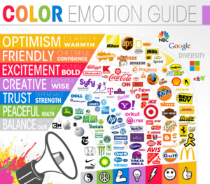
Apart from aesthetics, colours do have psychological effects on consumers as they are known to subconsciously influence consumers’ perception of brands, and ultimately their purchasing behavior. Therefore, you must select the right colours for your brand to establish authority in the industry! Some brands are synonymous with their colour – UPS with brown and gold, and Tiffany and Co.with its iconic robin egg colour – which by the way has its own Wikipedia page!
Can you identify what brands these are just by their colour scheme? Scroll down for the answers below!


Here’s a guide which tells you what each colour represents and the brands who use them!
Logos
A logos is the clothing to our brand – the first thing that people notice even before starting a conversation. Therefore, like how we often dress to impress, our logo must also leave the same positive impression on our target audiences. Apart from the professionalism that it brings, a good logo is also a visual identity that symbolizes everything that a brand represents. Here are some powerful design tips to create an effective logo!
~ Less is more
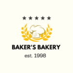
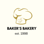
Complicated logos are eye-catching but overwhelming. Instead, keep it clean and simple by avoiding unnecessary designs that don’t value-add.
~ A picture speaks a thousand words
Don’t limit yourself to words! Try including relevant icons into your logo design to make it more memorable.

~ Life is more than just black and white
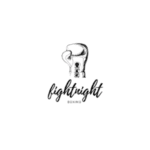
Appropriate colours can bring out the best of your brand. You can even try multiple shades of the same colour to create contrast in your design!
~ Flex your muscles
Ensure that your logo is taken seriously by your competitors and target audiences. Avoid childish fonts and go for a more corporate look unless you are marketing children’s clothes or toys.
Fonts
Fonts set the tone of the message and reflect the personality of your brand, hence allowing more effective communication with your target audience. Therefore, you need to be picking the right fonts for the different marketing content that your brand is putting out there! Select flexible fonts that can be applied across most, if not all, aspects of your business.
The last thing you want is to be confused over which type of font to use! Also ensure that your fonts are of different weights to differentiate between the headers, sub-headers, and body text such that it facilitates easy reading. Using the most appropriate font for your business is also crucial in ensuring that your brand message is crafted and conveyed aptly. For example, a law firm will be inclined to use Montserrat Regular for a more corporate look while Quicksand Bold looks great for an ice cream shop!
Therefore, choose fonts that resonate best with your business! As with changes are, rebranding may seem intimidating and scary at first but could be necessary at some point to bring your business up a notch (or two!). Contact our experienced brand consultants for more assistance on rebranding strategy!
Answers: Starbucks, Coca-Cola, Google